 |
| www.Blocks.com |
|
Click here to view the video: “RealCode Painting Price with Volume” |
The RealCode Paintbrushes allow you to paint any plot on your chart based on any conditions you like. In this video, I will show you one way to paint the price bars, based on how the bar closes various the previous bar and the type of volume associated with that bar.
We will start by adding volume bars to my chart, so I click on indicators and type in bars and I am going to drag our volume bars onto the chart and I also want moving
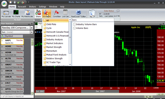
average of those volume bars, so I am going to go back up to indicators, type in moving average and I am going to drag that moving average on to those bars. So, this is just adding and moving average onto those bars and I am going make the moving average period 100.

So, here is the idea. Here is the volume bar and then this purple line represents the average volume for the previous 100 bars. What I want to do is I want to paint price
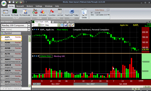
based on whether it closed up or down on that bar and if the volumes associated with that close is greater than the moving average of the volume.
Let’s go ahead create that paintbrush. I am going to click on RealCode Editor and go to Paintbrush. I am going to drag the paintbrush onto the price history because I
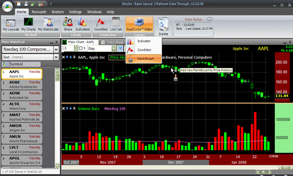
want to paint price history. This brings out my RealCode Editor.

Now, there are a couple of variables that I need. First I need a variable to represent these volume bars, so I am going to grab these bars and I am going to drag and
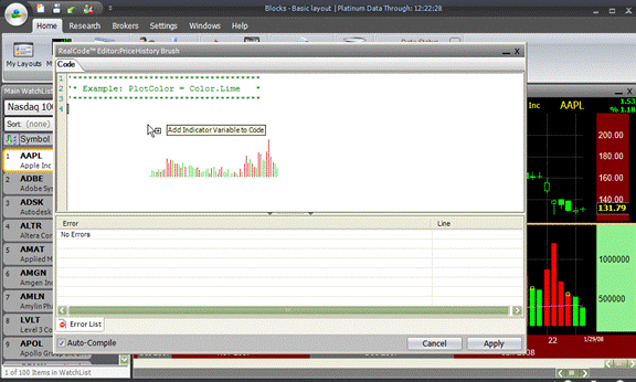
drop them into my code, that establishes VOLU to represent these volume bars and I
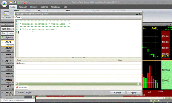
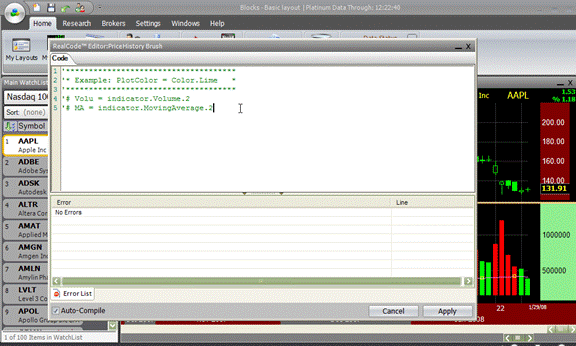
also need this moving average of volume, so I am going to grab that and drag and drop that into my code, and here we can see that now MA represents this purple average of the volume.
So, let’s start off simple. If price.close is greater than the price.close one bar ago and if the volume value is greater than the MA value (all this means that the volume is above the moving average) then plot color is going to equal the color lime.
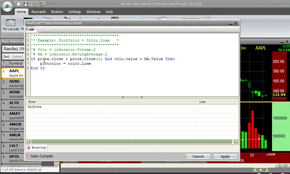
So, this simply says if the close is greater than previous close and the volume is above the moving average than plot it lime color or a bright green. Else if, the price.close is less than the price.close one bar ago and the value of the volume is greater than the MA value then the plot color is going equal the color of red.
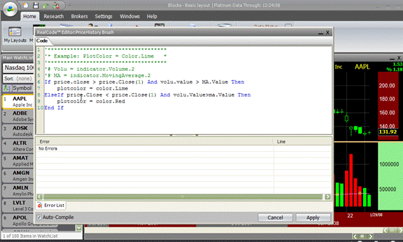
This says if the close is lower than the previous close and the volume is greater than the moving average (so still have above average volume) then plot it red, else plot color equals the color.white and this says that if neither of these conditions are true then plot it white.
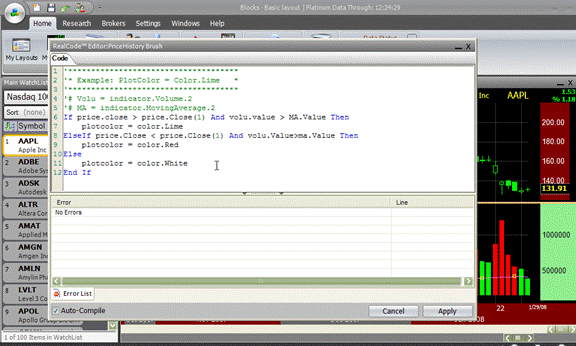
So, essentially if the price closes higher on above average volume, plot it lime. If the price closes lower on above average volume then plot it red, otherwise plot it white. So, it’s going to plot it white, basically if the move happens on volume that is below the moving average. I am going click apply and then close this.
So, as you can see now my price history is plotted based off of whether it closed higher or lower in the previous bar and if this volume is above average, so you will notice all of these white bars right here where the stock was closing up and down, well, because this volume is below the moving average, it just going to plot them white.
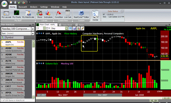
Whereas we look at this bar here is plotted green. It means it closed higher then the previous bar and we can see that right here, but also it did it on a volume bar that’s greater than the moving average. What this gives me is real easy way to visually check the type of volume action that’s happening with each of the moves on price.
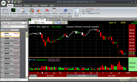
We will zoom this out just a little bit and let’s take a look at couple of charts. We will start off here by looking at Apple. Notice how easy it is for if I am going to use this, you see as Apple was coming up and making these highs here, but it was doing on below average volume because I can see all the white bars.
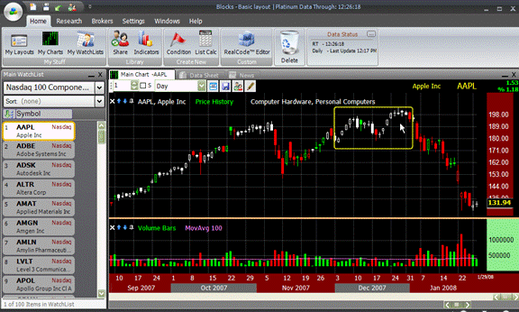
Now, notice the moves here. We see the stock moving up and down, but it is doing it based on above average volume because they are colored green and red. Notice as it
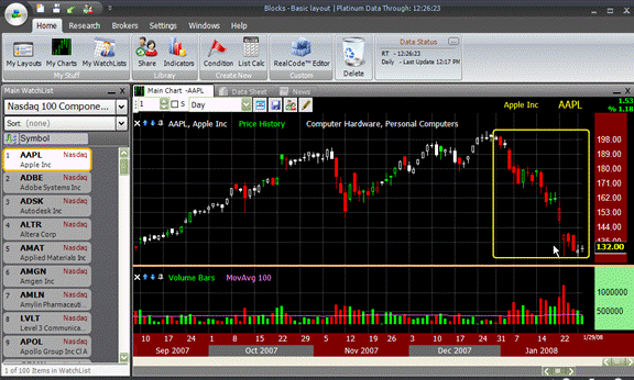
was making a run up here that many times it was making that run up on below average volume because I see so many white bars.
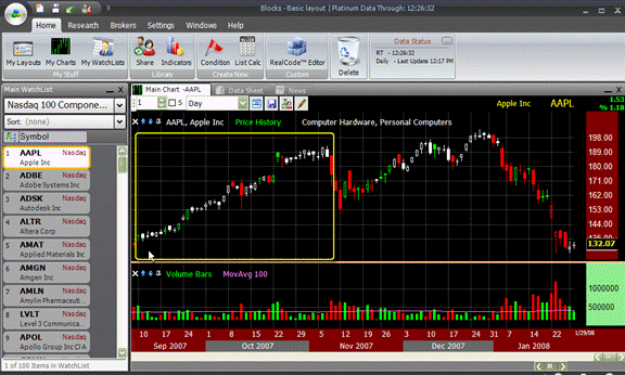
Let’s look at couple of other stocks. Here is another situation. We see the stock making highs, but on a below average volume and I can instantly see that by seeing
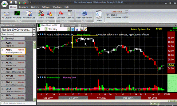
the white bars. We look at this move here down and we see it is happening on above average volume because the bars colored.
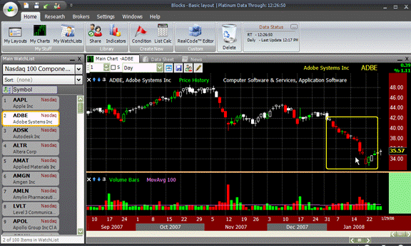
So now, I can just quickly space bar through the charts and instantly just by looking at the colors of price I can tell whether the moves are up or down and if they are happening on above or below average volume.
Let’s see if there are any other interesting ones here. Look at all this recent action on Apollo Group. It is all happening on above average volume because I have colored
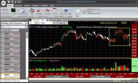
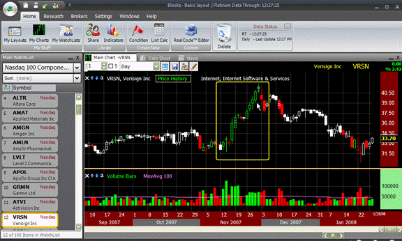
bars. I can see this run by Verisign that happened here in November, all happened on above average volume because again the bars are not white.
This is just one example of how to use the RealCode Paintbrush to paint a plot based on certain conditions. What I am going to do is I am going to go ahead and share this chart so that you can go ahead and load it inside of your system.
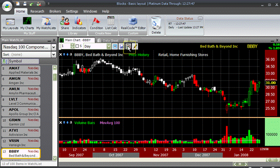
So, I am going to click the share button and I am going to call this RealCode Color Price based on volume. In the description, I will say created for the video on RealCode Paintbrush. I am going to go ahead and click share. It’s now sharing this chart to this shared library.
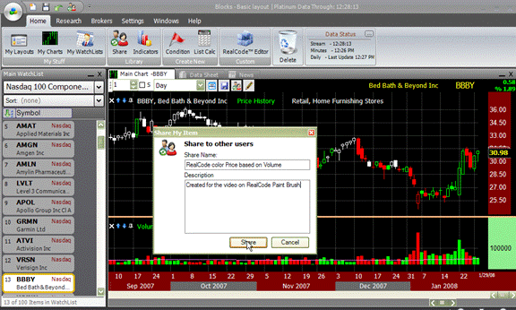
When you get done with this video, you can now get this chart and automatically just load it into your system. All you have to do is click the share button and in the shared library you should see shared by me, Craig, you should see the name, RealCode Color Price Bars based on volume and right now there is no view because I just shared it.
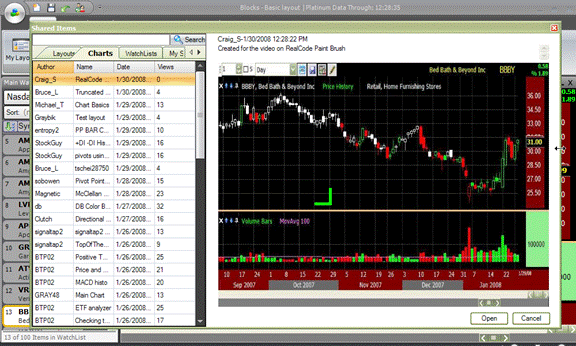
By the time you are watching this video it may further down this list. So what you might want to do is go into search and just search for video and click on search and it should come right up for you because I used the video, the description and that’s good key word search to find it.
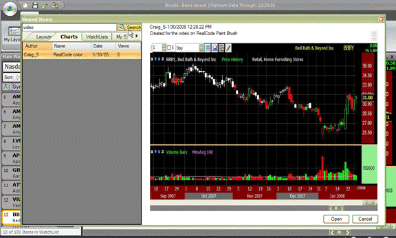
To open it, once you got it selected and you see the preview, just click on and open and it’s going to automatically add that chart to your layout and you can save it from there and keep it.
Go ahead and create your own paintbrushes and please share them so all of us can see and benefit from your work. Again, this is just one example of how you can paint a plot, using the RealCode paintbrushes, enjoy.
Total Duration: 8 Minutes.
|
Click here to view the video: “RealCode Painting Price with Volume” |
 Copyright 2008, Worden Brothers, Inc.
1-800-776-4940. Copyright 2008, Worden Brothers, Inc.
1-800-776-4940. |